Python Data Visualisation
In this lesson, we’ll explore one of the most widely used data visualisation libraries in Python: Matplotlib. It allows you to create a wide range of static, animated, and interactive plots, making it a powerful tool for data analysis and presentation.
By the end, you’ll understand how to create basic plots, customise them, and use different types of visualisations to communicate data insights effectively.
Table of Contents
What is Matplotlib?
Matplotlib is a comprehensive library for creating static, animated, and interactive visualizations in Python. It provides a high-level interface for producing publication-quality charts and graphs with minimal effort. Matplotlib is highly customizable, allowing you to adjust almost every aspect of your plots, from titles and labels to colors and styles.
Matplotlib is often used alongside libraries like NumPy and Pandas for data manipulation and analysis, making it a core tool for data science in Python.
To get started, install Matplotlib if you haven’t already:
pip install matplotlib
Getting Started with Matplotlib
To create basic plots using Matplotlib, you’ll primarily work with the pyplot module, which provides a MATLAB-like interface for generating plots.
Basic Example: Line Plot
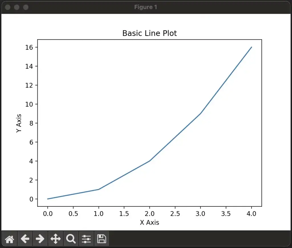
import matplotlib.pyplot as plt

# Simple data
x = [0, 1, 2, 3, 4]
y = [0, 1, 4, 9, 16]

# Create a line plot
plt.plot(x, y)

# Add labels and title
plt.xlabel("X Axis")
plt.ylabel("Y Axis")
plt.title("Basic Line Plot")

# Display the plot
plt.show()
plot(): Creates a line plot with the x and y data.xlabel(),ylabel(), andtitle(): Add labels to the axes and a title to the plot.show(): Displays the plot in a new window or inline, depending on your environment (e.g., Jupyter Notebook or Python script).
Common Plot Types in Matplotlib
Matplotlib provides many different types of plots. Let’s explore the most common ones and how to create them.
1. Line Plot
Line plots are useful for visualizing trends over time or continuous data.
import matplotlib.pyplot as plt

x = [0, 1, 2, 3, 4]
y = [0, 1, 4, 9, 16]

plt.plot(x, y, label='Line plot', color='blue', linestyle='--')
plt.xlabel("X Axis")
plt.ylabel("Y Axis")
plt.title("Line Plot Example")
plt.legend()  # Adds a legend

plt.show()
colorandlinestyle: Customize the color and style of the line (e.g., dashed line with--).
2. Scatter Plot
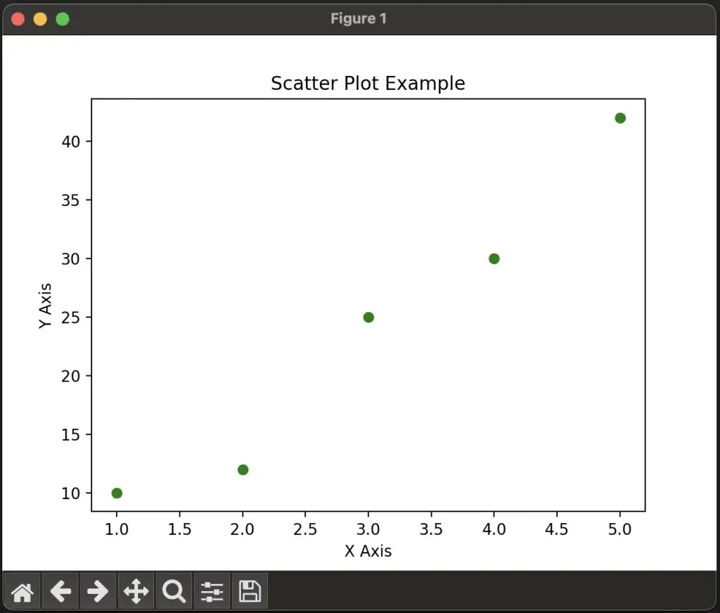
Scatter plots are ideal for visualizing relationships between two variables, especially when exploring correlation.
import matplotlib.pyplot as plt

x = [1, 2, 3, 4, 5]
y = [10, 12, 25, 30, 42]

plt.scatter(x, y, color='green', marker='o')
plt.xlabel("X Axis")
plt.ylabel("Y Axis")
plt.title("Scatter Plot Example")

plt.show()
scatter(): Creates a scatter plot with data points represented by markers.marker: Specifies the shape of the markers (e.g.,ofor circles).
3. Bar Plot
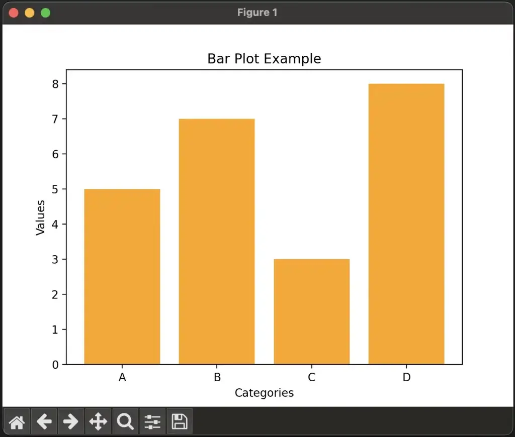
Bar plots are used for comparing categorical data.
import matplotlib.pyplot as plt

categories = ['A', 'B', 'C', 'D']
values = [5, 7, 3, 8]

plt.bar(categories, values, color='orange')
plt.xlabel("Categories")
plt.ylabel("Values")
plt.title("Bar Plot Example")

plt.show()
bar(): Creates a vertical bar plot. Usebarh()for horizontal bars.
4. Histogram
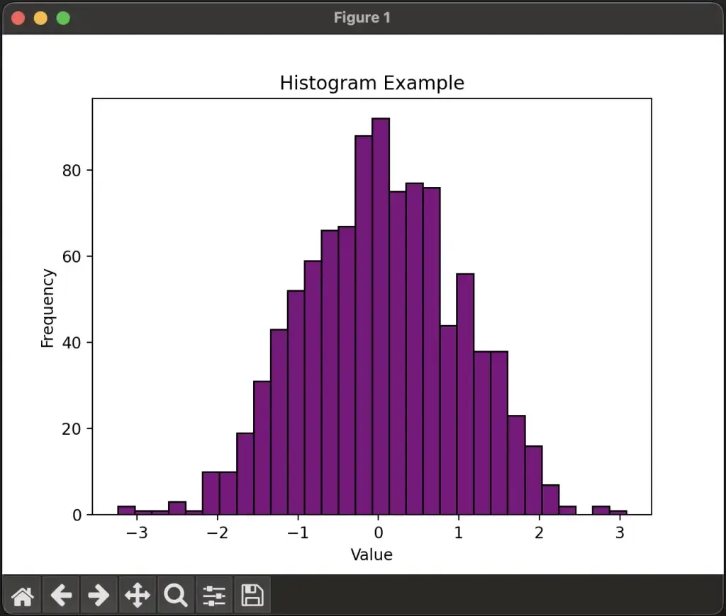
Histograms are useful for visualizing the distribution of numerical data.
import matplotlib.pyplot as plt
import numpy as np

data = np.random.randn(1000)

plt.hist(data, bins=30, color='purple', edgecolor='black')
plt.xlabel("Value")
plt.ylabel("Frequency")
plt.title("Histogram Example")

plt.show()
hist(): Creates a histogram. Thebinsargument controls the number of bars.np.random.randn(): Generates random numbers from a standard normal distribution.
5. Pie Chart
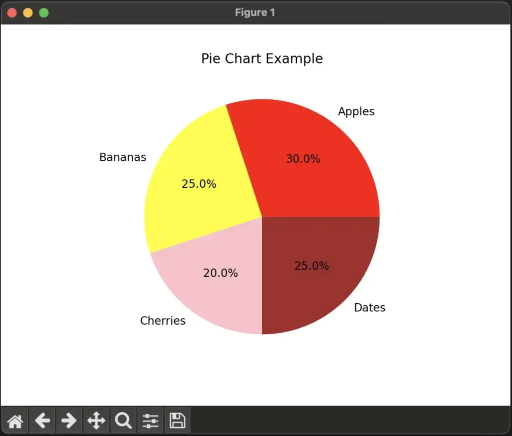
Pie charts are useful for showing proportions or percentages.
import matplotlib.pyplot as plt

labels = ['Apples', 'Bananas', 'Cherries', 'Dates']
sizes = [30, 25, 20, 25]

plt.pie(sizes, labels=labels, autopct='%1.1f%%', colors=['red', 'yellow', 'pink', 'brown'])
plt.title("Pie Chart Example")

plt.show()
pie(): Creates a pie chart. Theautopctargument adds percentage labels to each slice.
Customizing Plots
Matplotlib provides extensive options to customize your plots, from basic features like labels and titles to advanced styling options.
1. Adding Labels, Titles, and Legends
You can easily add axis labels, titles, and legends to make your plots more informative.
import matplotlib.pyplot as plt

x = [1, 2, 3, 4, 5]
y1 = [1, 4, 9, 16, 25]
y2 = [25, 16, 9, 4, 1]

plt.plot(x, y1, label='Increasing', color='blue')
plt.plot(x, y2, label='Decreasing', color='red')

# Adding labels and title
plt.xlabel("X Axis")
plt.ylabel("Y Axis")
plt.title("Multiple Lines Example")

# Adding a legend
plt.legend()

plt.show()
legend(): Adds a legend to differentiate between lines or data points.xlabel()andylabel(): Add labels to the x-axis and y-axis.
2. Changing Colors, Markers, and Line Styles
Matplotlib allows you to fully customize the appearance of lines and markers.
import matplotlib.pyplot as plt

x = [1, 2, 3, 4, 5]
y = [2, 4, 6, 8, 10]

# Customizing color, marker, and line style
plt.plot(x, y, color='green', marker='s', linestyle='-.', linewidth=2)

plt.xlabel("X Axis")
plt.ylabel("Y Axis")
plt.title("Customized Line Example")

plt.show()
color: Sets the color of the line (e.g., ‘green’).marker: Specifies the marker type (e.g.,sfor square).linestyle: Defines the line style (e.g.,-.for dash-dot).linewidth: Adjusts the thickness of the line.
3. Gridlines and Ticks
You can customize the gridlines and ticks to enhance the readability of your plots.
import matplotlib.pyplot as plt

x = [1, 2, 3, 4, 5]
y = [2, 4, 6, 8, 10]

plt.plot(x, y)

# Adding gridlines
plt.grid(True)

# Customizing ticks
plt.xticks([1, 2, 3, 4, 5], ['One', 'Two', 'Three', 'Four', 'Five'])
plt.yticks([2, 4, 6, 8, 10])

plt.xlabel("Custom X Axis")
plt.ylabel("Y Axis")
plt.title("Grid and Custom Ticks Example")

plt.show()
grid(): Adds gridlines to the plot.xticks()andyticks(): Customize the tick marks and labels on the axes.
Subplots: Multiple Plots in One Figure
Matplotlib allows you to create multiple plots in a single figure using the subplot() or subplots() function.
Example: Creating Multiple Subplots
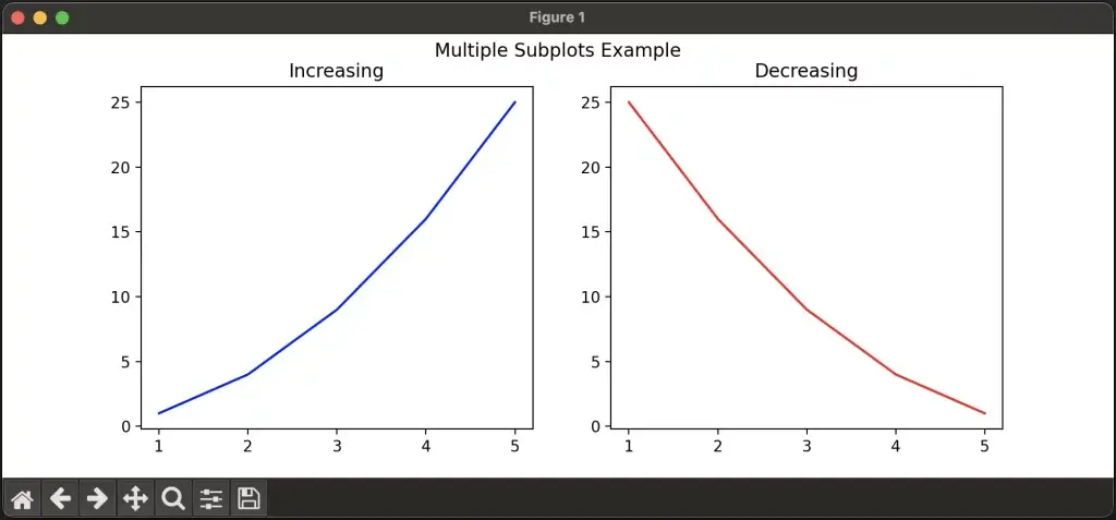
import matplotlib.pyplot as plt

x = [1, 2, 3, 4, 5]
y1 = [1, 4, 9, 16, 25]
y2 = [25, 16, 9, 4, 1]

# Create a figure with two subplots
fig, (ax1, ax2) = plt.subplots(1, 2, figsize=(10, 4))

# First subplot
ax1.plot(x, y1, color='blue')
ax1.set_title("Increasing")

# Second subplot
ax2.plot(x, y2, color='red')
ax2.set_title("Decreasing")

plt.suptitle("Multiple Subplots Example")  # Overall title for the figure
plt.show()
subplots(): Creates a grid of subplots. Thefigsizeparameter sets the size of the figure.set_title(): Adds a title to each subplot.
Working with Images
Matplotlib can also display images using the imshow() function, which is useful
for visualizing data like heatmaps or matrix representations.
Example: Displaying an Image
import matplotlib.pyplot as plt
import numpy as np

# Create a random matrix
data = np.random.rand(10, 10)

# Display the matrix as an image
plt.imshow(data, cmap='viridis', interpolation='nearest')
plt.colorbar()  # Add a colorbar for reference
plt.title("Heatmap Example")
plt.show()
imshow(): Displays an image or matrix as a plot.cmap: Specifies the colormap (e.g., ‘viridis’).colorbar(): Adds a colorbar to the plot to indicate the mapping of values to colors.
Saving Figures
Matplotlib allows you to save your plots as images or vector graphics files using the savefig() function.
Example: Saving a Plot as an Image
import matplotlib.pyplot as plt

x = [1, 2, 3, 4, 5]
y = [2, 4, 6, 8, 10]

plt.plot(x, y)
plt.xlabel("X Axis")
plt.ylabel("Y Axis")
plt.title("Save Plot Example")

# Save the plot as a PNG file
plt.savefig('plot.png')

plt.show()
savefig(): Saves the current figure to a file. You can specify formats such as PNG, PDF, or SVG.
Integrating Matplotlib with Pandas
Matplotlib works seamlessly with Pandas, allowing you to plot data directly from Pandas DataFrames.
Example: Plotting Data from a Pandas DataFrame
import matplotlib.pyplot as plt
import pandas as pd

# Create a simple DataFrame
data = {
    'Month': ['January', 'February', 'March', 'April', 'May'],
    'Sales': [200, 220, 250, 270, 300]
}
df = pd.DataFrame(data)

# Plot the data using Pandas
df.plot(x='Month', y='Sales', kind='line', marker='o', title='Sales Over Time')

plt.ylabel("Sales")
plt.show()
plot(): Plots data directly from a Pandas DataFrame. You can specify the plot type with thekindargument (e.g., ‘line’, ‘bar’, ‘scatter’).
Key Concepts Recap
In this lesson, we looked at how to create a wide range of plots using Matplotlib, including line plots, scatter plots, bar charts, histograms, and pie charts. You also explored customization options, such as changing colors, adding gridlines, and working with multiple subplots.
Matplotlib is a versatile library for creating visualizations, and its integration with Pandas makes it a powerful tool for data analysis and reporting. Whether you’re visualizing trends over time, exploring relationships between variables, or comparing categories, Matplotlib provides all the tools needed to effectively communicate data insights.
By mastering Matplotlib, you’ll be able to produce clear and visually appealing charts and graphs that are essential for presenting your data in a meaningful way.
Exercises
- Create a line plot of the sine and cosine functions on the same figure. Use different colors and line styles for each function and add a legend.
- Generate random data and create a histogram. Adjust the number of bins to see how it affects the appearance of the histogram.
- Create a bar plot that compares the sales of different products over several months. Customize the colors of the bars and add a title and axis labels.
- Use
subplot()to create a 2×2 grid of subplots showing different types of plots (e.g., line plot, scatter plot, bar plot, pie chart) with different data.
FAQ
Q1: What is the difference between plt.plot() and plt.scatter()?
A1:
plt.plot()is used to create line plots, where data points are connected by lines. It’s ideal for visualizing trends or continuous data over time.plt.scatter()is used to create scatter plots, which display individual data points without connecting them. Scatter plots are better suited for visualizing the relationship or correlation between two variables.
Q2: How do I customize the appearance of my plot (e.g., change colors, markers, and line styles)?
A2: You can customize your plots using various arguments in the plotting functions:
color: Change the color of the line or points (e.g.,'red','blue', or hexadecimal codes like'#ff5733').marker: Choose the shape of the data points in scatter or line plots (e.g.,'o'for circles,'s'for squares,'^'for triangles).linestyle: Set the style of the line (e.g.,'-'for solid,'--'for dashed,'-.'for dash-dot).linewidth: Adjust the thickness of lines.
Example:
plt.plot(x, y, color='green', marker='s', linestyle='-.', linewidth=2)
Q3: How do I create multiple subplots in one figure?
A3: You can create multiple subplots in one figure using the plt.subplots() function. It allows you to specify the number of rows and columns of subplots and gives you access to individual axes for customization.
Example:
fig, (ax1, ax2) = plt.subplots(1, 2)  # Create two subplots in a 1x2 grid
ax1.plot(x1, y1)
ax2.plot(x2, y2)
plt.show()
This creates two subplots side by side, each with its own axes.
Q4: How can I save a plot as an image file?
A4: You can save a plot to an image file using the plt.savefig() function. You can specify the filename and format (e.g., PNG, PDF, SVG).
Example:
plt.plot(x, y)
plt.savefig('my_plot.png')  # Saves the plot as a PNG image
You can also specify the resolution of the saved image using the dpi argument:
plt.savefig('my_plot.png', dpi=300) # High-resolution image
Q5: How do I add titles, labels, and legends to my plot?
A5:
plt.title(): Adds a title to your plot.plt.xlabel()andplt.ylabel(): Add labels to the x-axis and y-axis, respectively.plt.legend(): Adds a legend to your plot to label different lines or data points.
Example:
plt.plot(x, y, label='Line A')
plt.xlabel('X Axis')
plt.ylabel('Y Axis')
plt.title('Example Plot')
plt.legend()
plt.show()
Q6: How can I display a color gradient or heatmap in Matplotlib?
A6: You can display a color gradient or heatmap using plt.imshow(). This function takes a 2D array and displays it as an image, where the color of each cell corresponds to the value in the array.
Example:
import numpy as np
data = np.random.rand(10, 10)  # Create random 2D data
plt.imshow(data, cmap='viridis')  # Use 'viridis' colormap
plt.colorbar()  # Add a colorbar to show the value scale
plt.show()
Q7: How do I control the number of bins in a histogram?
A7: You can control the number of bins in a histogram using the bins argument in plt.hist(). The bins argument defines how many intervals or bars you want in the histogram.
Example:
plt.hist(data, bins=20)  # Creates a histogram with 20 bins
plt.show()
Q8: How do I add gridlines to my plot?
A8: You can add gridlines to your plot using the plt.grid() function. You can control the appearance of the gridlines (e.g., line style, color) using additional arguments.
Example:
plt.plot(x, y)
plt.grid(True)  # Add gridlines
plt.show()
For more control:
plt.grid(color='gray', linestyle='--', linewidth=0.5) # Customize gridlines
Q9: How do I plot data directly from a Pandas DataFrame?
A9: Matplotlib integrates seamlessly with Pandas, allowing you to plot data directly from a Pandas DataFrame using the plot() method. You can specify the type of plot with the kind argument.
Example:
import pandas as pd
data = {'Month': ['Jan', 'Feb', 'Mar'], 'Sales': [200, 220, 250]}
df = pd.DataFrame(data)

df.plot(x='Month', y='Sales', kind='line', marker='o')
plt.ylabel('Sales')
plt.show()
Q10: How do I adjust the figure size in Matplotlib?
A10: You can adjust the size of your figure using the figsize argument in plt.figure() or plt.subplots(). The figsize argument takes a tuple (width, height) in inches.
Example:
plt.figure(figsize=(8, 6))  # Width = 8 inches, Height = 6 inches
plt.plot(x, y)
plt.show()
Alternatively, you can specify the figure size in subplots():
fig, ax = plt.subplots(figsize=(10, 4))
ax.plot(x, y)
plt.show()
Q11: What’s the difference between plt.show() and plt.savefig()?
A11:
plt.show(): Displays the plot in a window or inline (e.g., in Jupyter notebooks). It renders the plot for viewing but does not save it.plt.savefig(): Saves the plot to a file in a specified format (e.g., PNG, PDF). It doesn’t display the plot but writes it to a file.
Typically, you use plt.show() when you want to visualize the plot and plt.savefig() when you need to save the output as an image file.
Q12: How do I handle overlapping plots or labels?
A12: To handle overlapping plots or labels, you can use plt.tight_layout(), which automatically adjusts the spacing between subplots, labels, and other elements to prevent overlap.
Example:
plt.plot(x, y)
plt.xlabel("X Axis Label")
plt.ylabel("Y Axis Label")
plt.title("Plot with Adjusted Layout")
plt.tight_layout()  # Adjusts layout to prevent overlap
plt.show()
For more control over spacing, you can use plt.subplots_adjust():
plt.subplots_adjust(left=0.1, right=0.9, top=0.9, bottom=0.1)
Q13: Can I create interactive plots with Matplotlib?
A13: While Matplotlib is mainly used for static plots, you can create interactive plots by enabling %matplotlib notebook in Jupyter Notebook or using libraries like mplcursors for hover and click interactivity.
To use interactive mode in Jupyter:
%matplotlib notebook
import matplotlib.pyplot as plt
plt.plot(x, y)
plt.show()
For more advanced interactivity, consider using Plotly or Bokeh, which are designed for interactive plotting.